Biggest issue ever
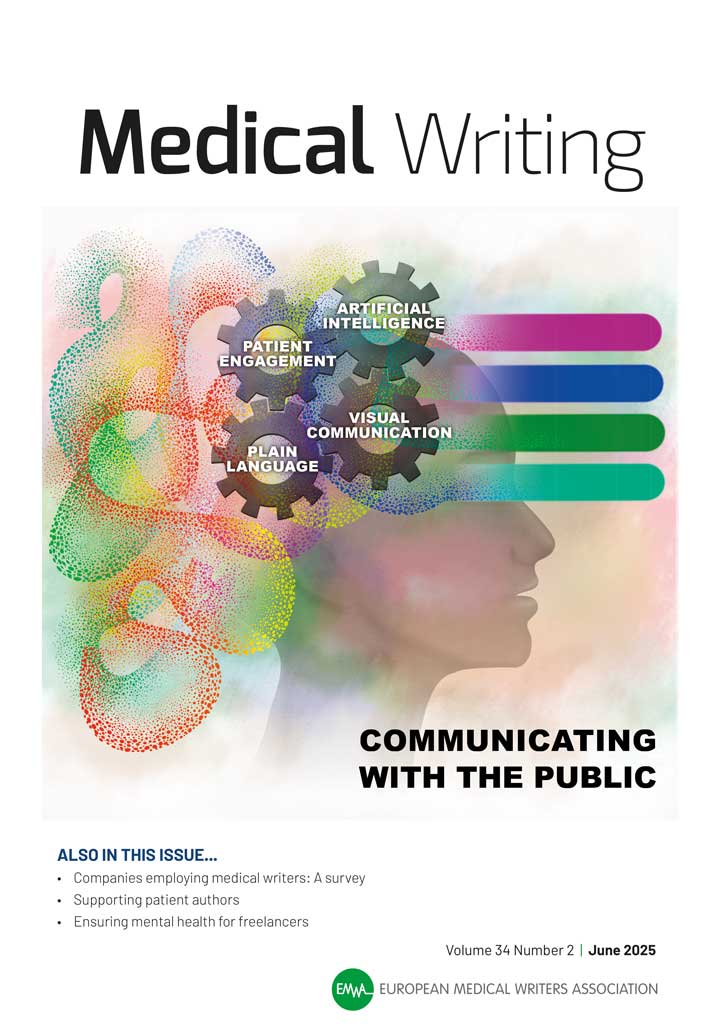
The European Medical Writers Association (EMWA) has been the trade body for medical writers for a long time now. We have designed their magazine, Medical Writing, for a while now. Published quarterly, their Summer edition is the biggest ever with 136 pages. Fair to say, going from strength to strength. Its full of in depth […]
Pharos Statistics Issue
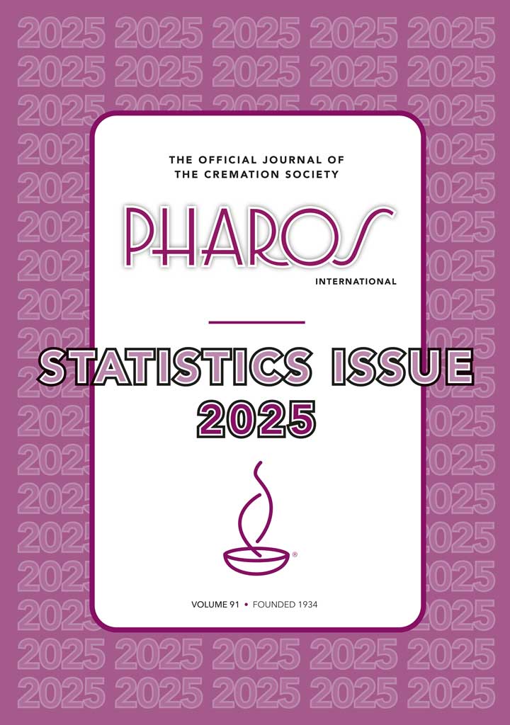
We have just finished this year’s Statistics issue for the UK Cremation Society. Well done their new Assistant Editor Chantelle for coordinating what is another successful compilation. The review compiles UK statistics of many aspects of the UK cremation sector (the UK has 340 crematoria, both private and public), contrasts and compares with previous years […]
The Sibelius organ in Finland
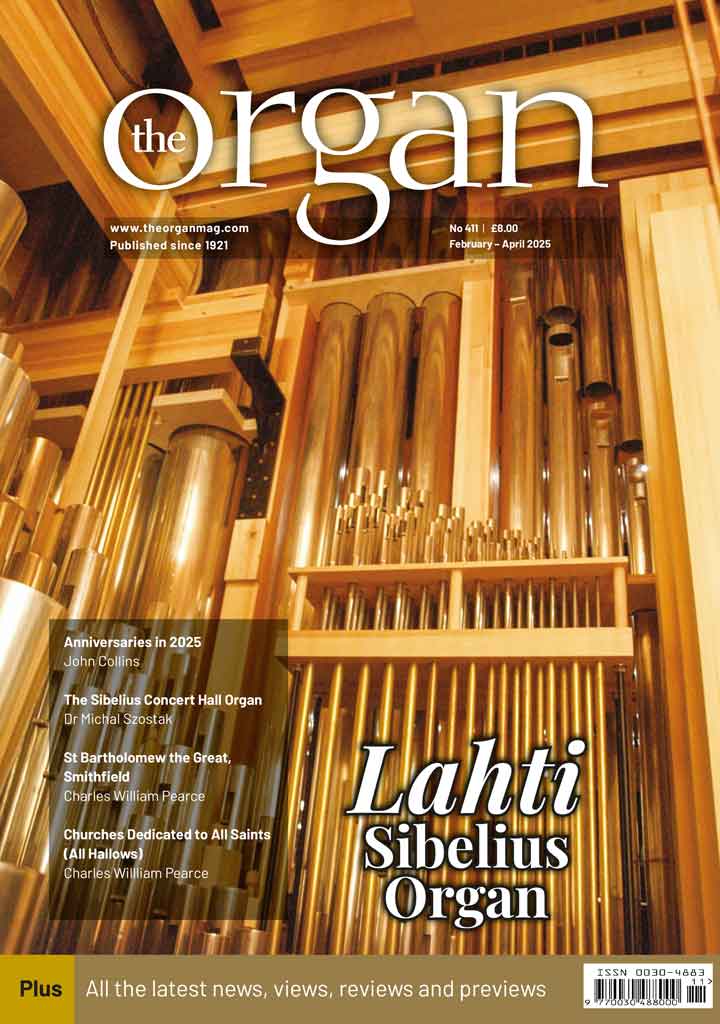
The Sibelius organ in Finland is the main feature article in the January-March 2025 edition of The Organ (a magazine we have designed for 25 years plus). A beatiful organ, a beautiful space – lots of history and heritage. History, and full specification with many many photos in full colour.
This year’s Pharos colour
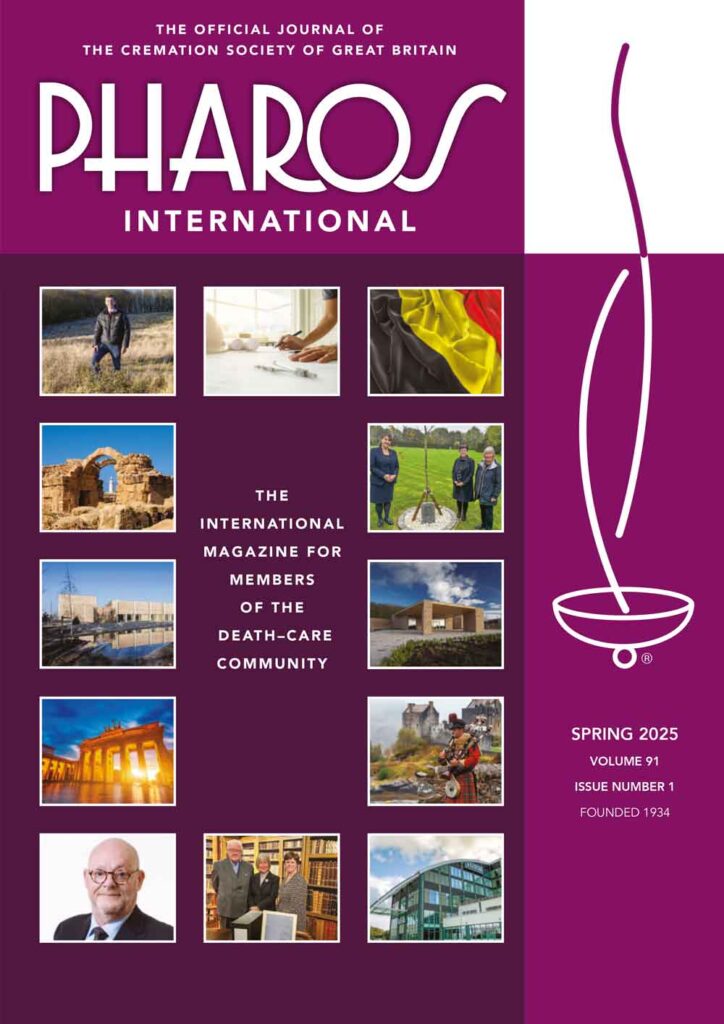
Every year the Cremation Society – whose magazine we have designed for 25 years – choose a different colour for current year. This year its this lovely dark purple colour. For 2026 – who knows?
Vintners’ Annual Review 2024
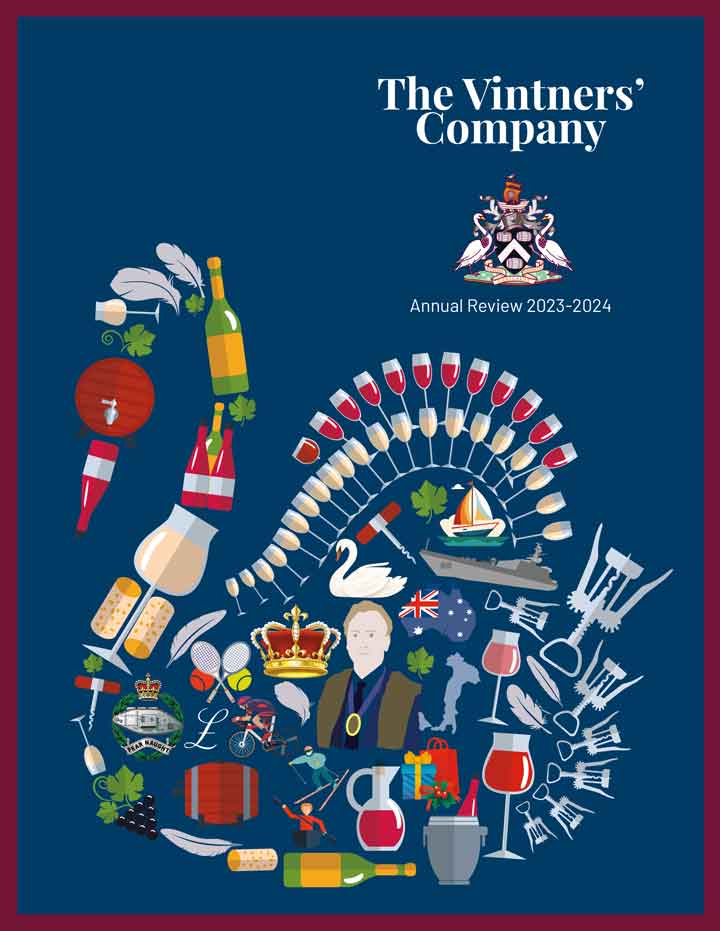
The City Livery company, The Vintners, active since 1363, has been a force in the land for over 650 years. We have compiled and printed their latest annual review, which outlines their activities, aims, objectives and daily round of existance. Undersized A4, 88pp, matt paper.
Vintners’ Annual Review
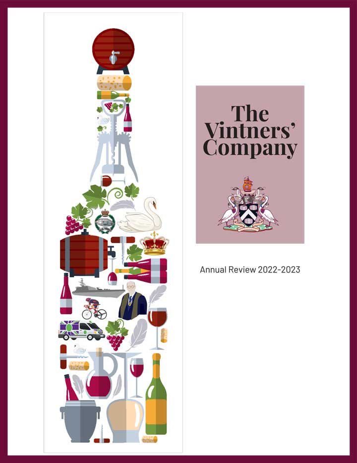
The City Livery company, The Vintners, active since 1363, has been a force in the land for over 650 years. We have compiled and printed their latest annual review, which outlines their activities, aims, objectives and daily round of existance. Undersized A4, 80pp, matt paper.
A new redesign for the Wheelwrights
The City livery company, The Honourably Company of Wheelwrights has been in existance for centuries. Because of covid they have not felt the need for an annual review as frankly they haven’t really done that much – certainly not worth mentioning (except of course their not insignificant charitable giving). We recently undertook to redesign this […]
A redesign for the Fruiterers
The City livery company, The Honourably Company of Fruiterers has been in existance for centuries. We have been designing their quarterly newsletter for a fraction of that time but still a few years now. We recently undertook to redsign this with a new look, it is now redesigned to look more contemporary: cleaner, easier to […]
The European Medical Writers Association
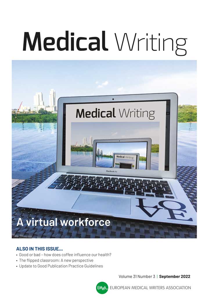
We have been designing the European Medical Writers Assocation’s house magazine, Medical Writing, since 2016. They are an exacting and precise crowd so when they say the following our hearts were warmed: “BTW, the issue looks absolutely beautiful. I think it may be the most visually attractive issue we have put out yet since […]
‘Repairing’ photos
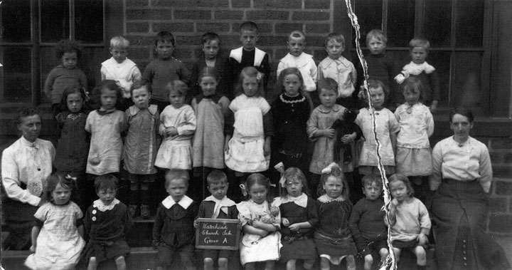
Sometimes we receive an image which, for a whole variety of reasons is not as you would like. Perhaps its a bit dark, or too light, the subject has a large spot on the end of their nose. etc … Occasionally it goes beyond that… the photo is plain not very good but – here […]